End to End Experience Design
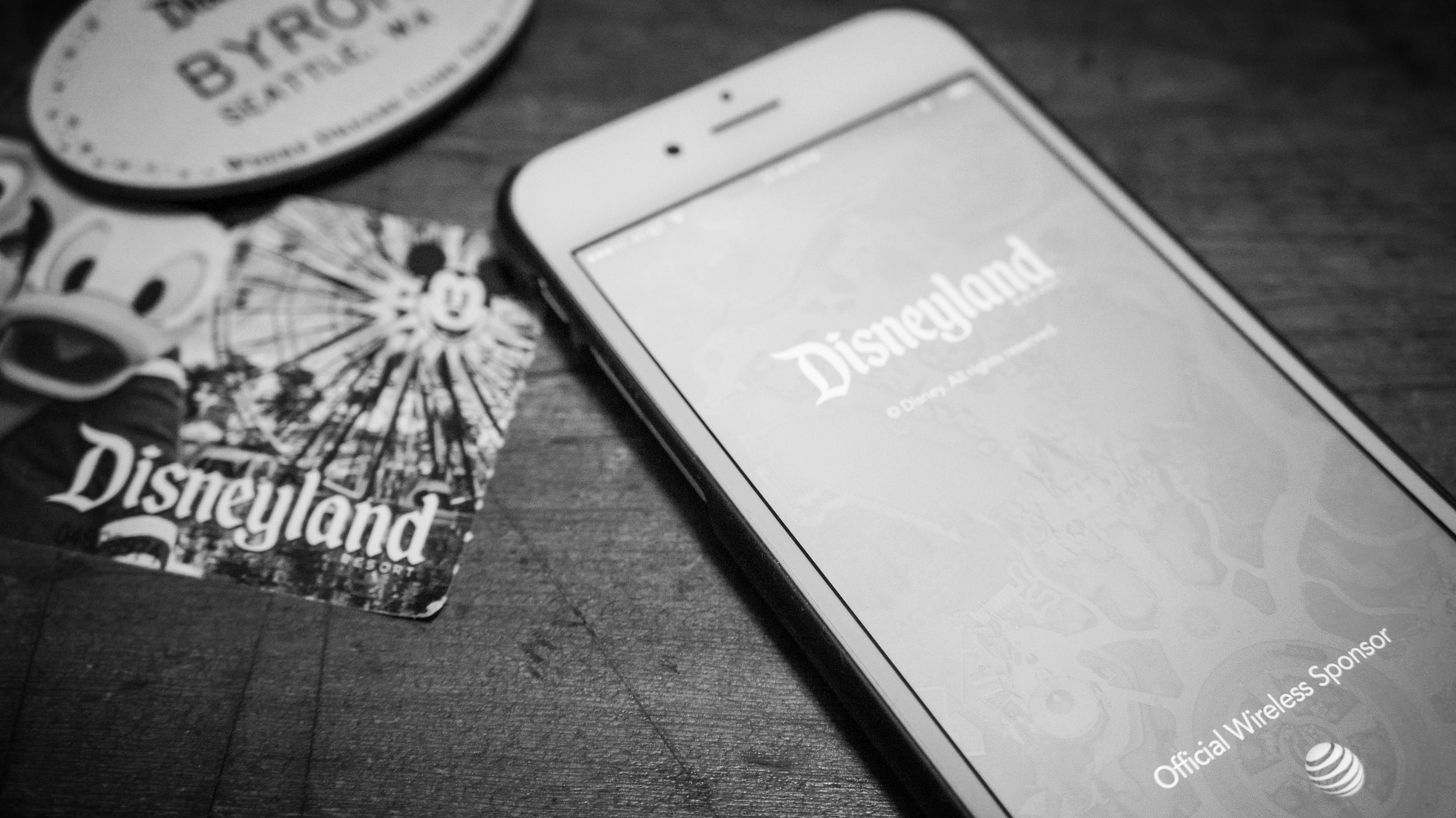
My team designed the official mobile app for the Disneyland® Resort, released in 2015. As senior designer on the project, I worked closely with my interaction design counterpart to concept and design the end to end experience. I was personally responsible for both concept development and executing on visual design & UI documentation. Together, we worked directly with senior executives, key business stakeholders, product managers and engineers to design and launch a simple and useful digital experience for park guests to help manage their vacation. Using an iPhone or Android smartphone, guests can buy tickets, book dining reservations, see wait times, browse maps, locate Disney Characters appearing throughout the parks and manage their vacation from start to finish.
My Role
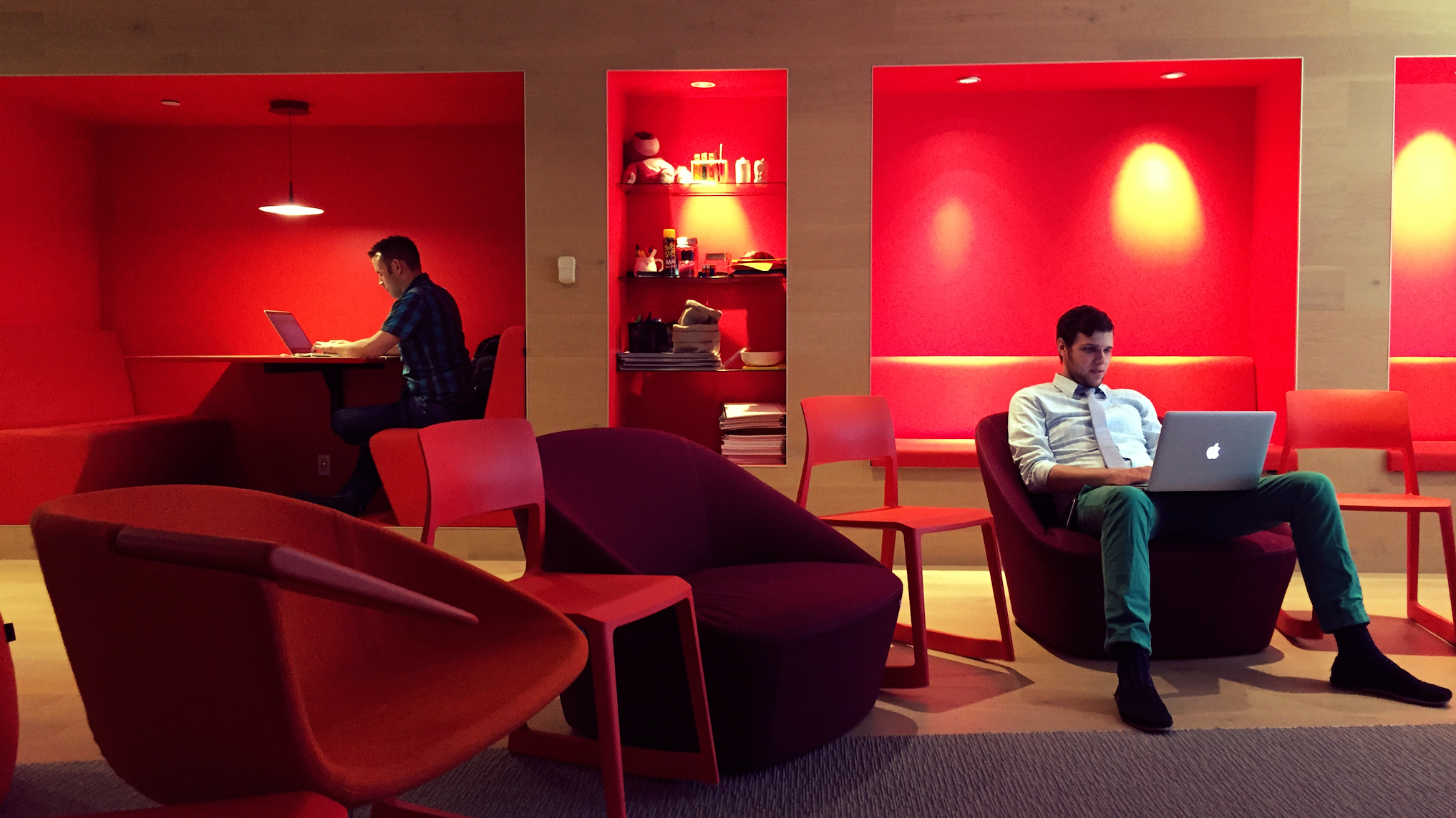
Senior Visual Designer was a loose title, but I touched every design aspect of the visual design of the app from start to finish, working closely with a key interaction design partner and various managers who did their best to unblock us and keep the runway clear. My role was very fluid, part of a small team, so I often spent just as much time leading concept and whiteboard sessions with big ideas and a high level creative vision to work towards, as well as getting deep in the weeds to iterate and refine on tons of small details. I also had the opportunity to mentor interns and junior designers, drive the myriad visual design tasks, prototyping and documentation for the app and it's various features. This was a very flexible and ambitious role for me, playing equal parts designer and design leader, resource negotiator and design advocate, giving huge presentations to senior executives and stakeholders along the way.
Process
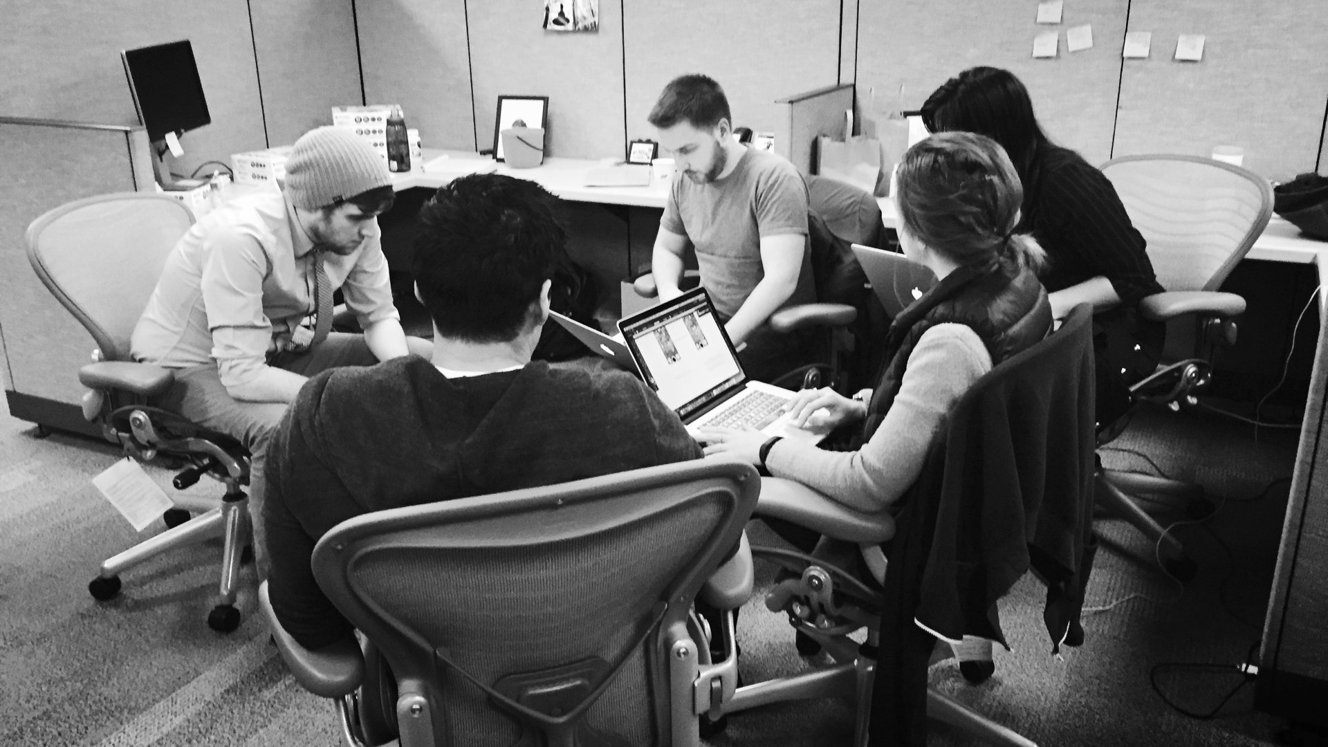
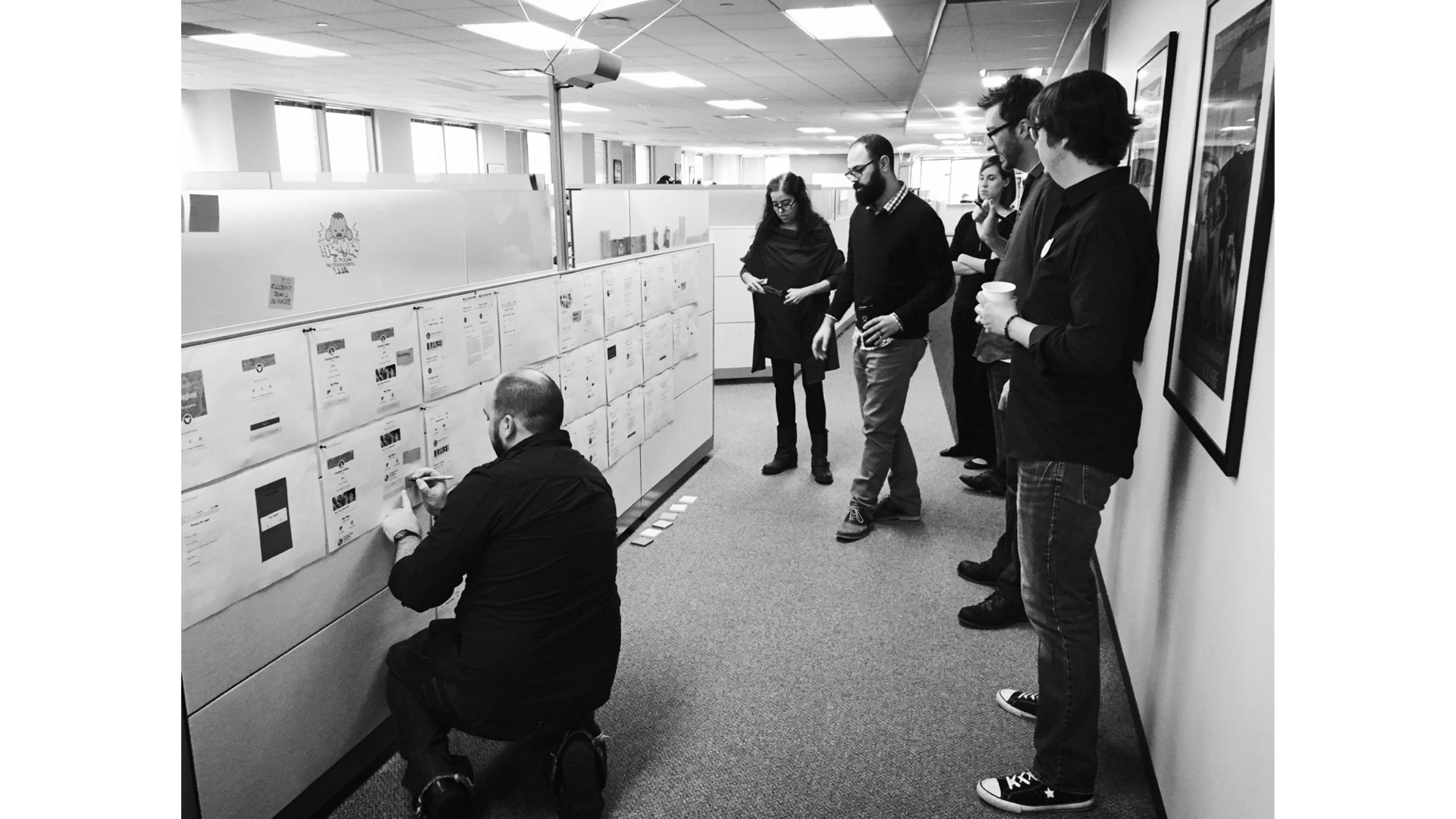
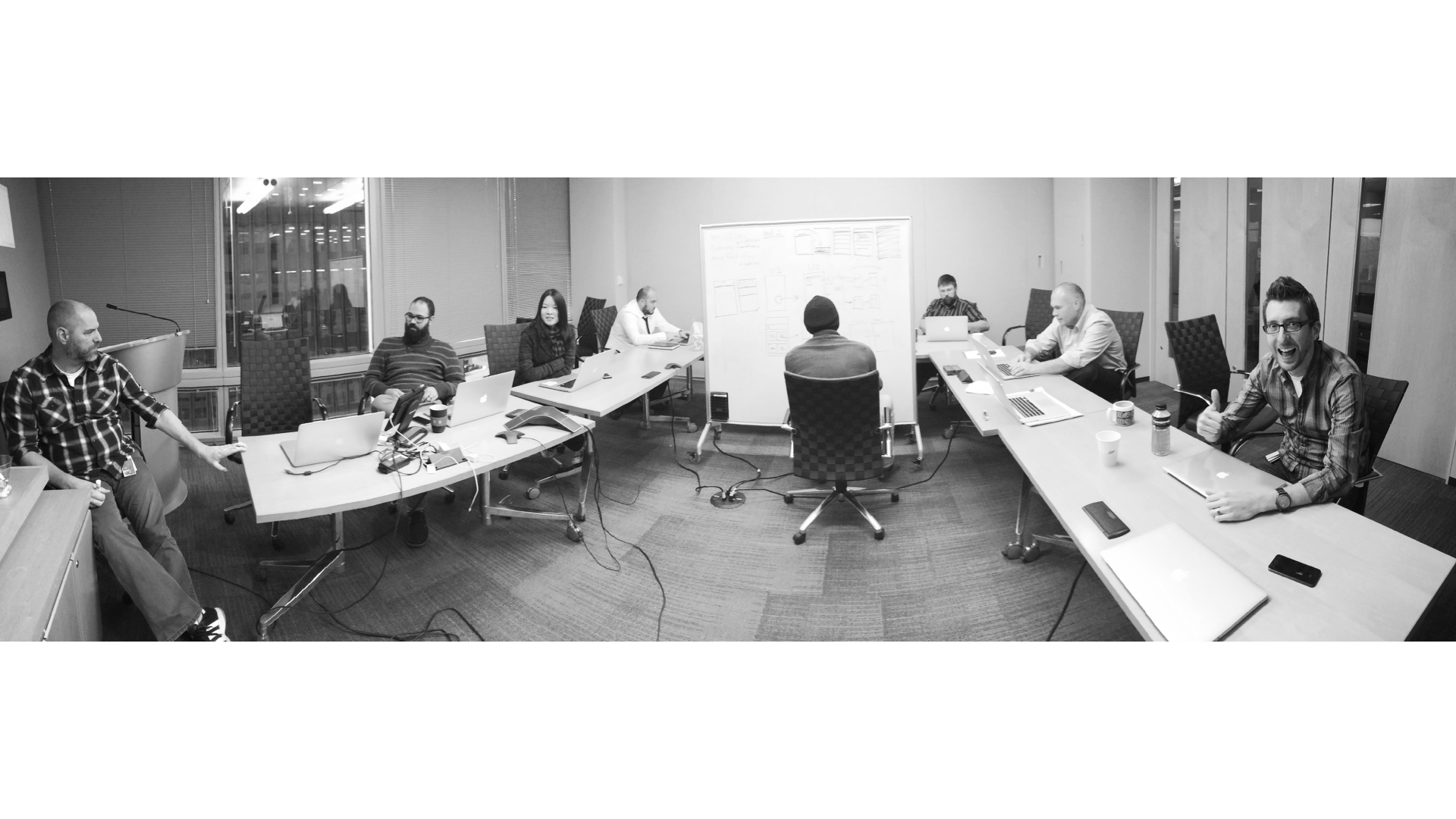
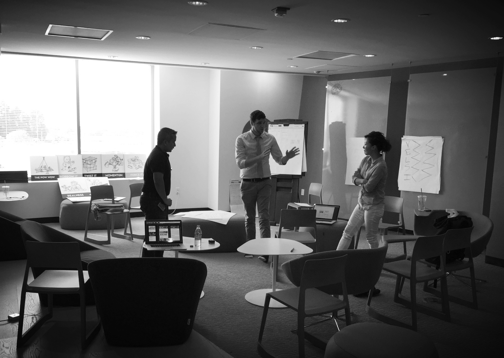
Our process was fast and very scrappy in the design and discovery phases. We can't go into too much detail, but there was a ton of overlap between UX and UI. My design partner and I would knock out whole whiteboards of concepts to try and solve different user problems, from core navigation (how do I find stuff in the park?) to the best way to display park hours (icons? graphs & charts? numbers?). End to end experience design. This was an incredible learning process for me, working so closely with a product designer with serious UX chops. Regular check in's with engineers, product managers and key stakeholders were also essential, and layers of approvals were skimmed and tightened to make way for rapid iteration and reaction to partner feedback taking hours, not weeks. It was intense but rewarding. Our managers stocked the fridge with Red Bull and endless cups of coffee. Regular jam sessions and check-in’s with engineers, product managers and key stakeholders were essential. We waded through layers of stakeholder review cycles and approvals with patience and poise, sharing ideas with storyboards, prototypes and rapid iteration and refinement.
A New Design Language
This was the first app for Disney Parks & Resorts to utilize a new and evolved design language for Disney mobile products moving forward. There were plenty of times where we felt like we were building an airplane while it was flying, but our team managed to push through to design and ship an incredibly useful product and digital touch point for millions of Disney guests. The design system we implemented was a breath of fresh air, clean and simple with an emphasis on clarity and intention, and featuring new interaction and visual design patterns to make ticket purchases and dining reservations super easy, straightforward and even a little fun.
Get the App
Disneyland
https://disneyland.disney.go.com/guest-services/download-disneyland-mobile-app/
Buzz
OC Register
http://www.ocregister.com/articles/app-676034-disneyland-disney.html
PopSugar
http://www.popsugar.com/tech/Disneyland-App-38190403
Android Police
Extra Credit
Design
Ben Painter
John Michael
Eunha Kim
Joyce Baltazar
Elise Pescheret
Hillary Radbill
Joseph Pacheco
Troy Parke
Engineering
Amy Sun
Jim Rodden
Daniel Clark
Product Management
Eric Bautista
Kaylynn Sung


